OEE Chart
The OEE Chart on the OEE Dashboard contains each of the four primary KPIs, and a chart of those KPIs over the selected date range.
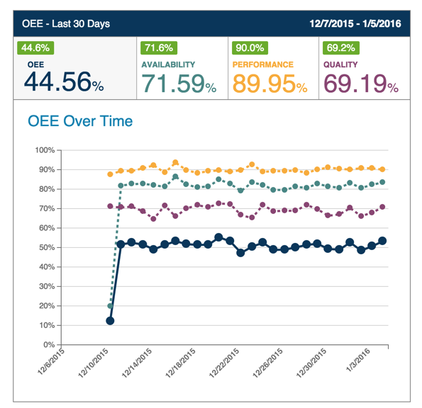
The values above the KPIs represent the percent change in that KPI over the selected date range (indicated as green for positive change and red for negative). You can hover over those values for more information.
Clicking on any of the KPIs will navigate you to the Data tab, with filters pre-applied to load the relevant dataset over the same date range.
Clicking on a data point in the chart will navigate you to the Data tab, with filters pre-applied to load the relevant dataset for that specific date.